This case study showcases: Accessibility-first design • Universal design principles • B2B UX • Design systems
Role: UX Designer | Timeline: 6 months | Team: 3 developers, 1 Product Manager |
Sooner or later, we all face limitations — a broken arm, carrying a baby, or, like me, recovering from heavy dental anesthesia. I spent hours unable to speak, and it made me think:
How often do we design for those moments, not just for ideal ones?
For us, form handling was more than just data collection—it was the lifeblood of innovation processes. Our platform served major enterprises like AstraZeneca, Microsoft, Barclays, and Aviva, while simultaneously powering crowd innovation challenges for thousands of users.
But here's the complexity: every innovation journey began with a form. Whether it was a corporate challenge or a public innovation contest, these weren't simple contact forms—they were extensive, multi-layered questionnaires that needed to capture rich innovation data while being flexible enough for different contexts.
Discovering the Real Story
As a UX Designer, I led research, prototyping, and collaborated closely with the product manager to design a new experience. Our team included 3 frontend developers and 1 PM. I was involved in the project from February 2024 until I left the company in August.
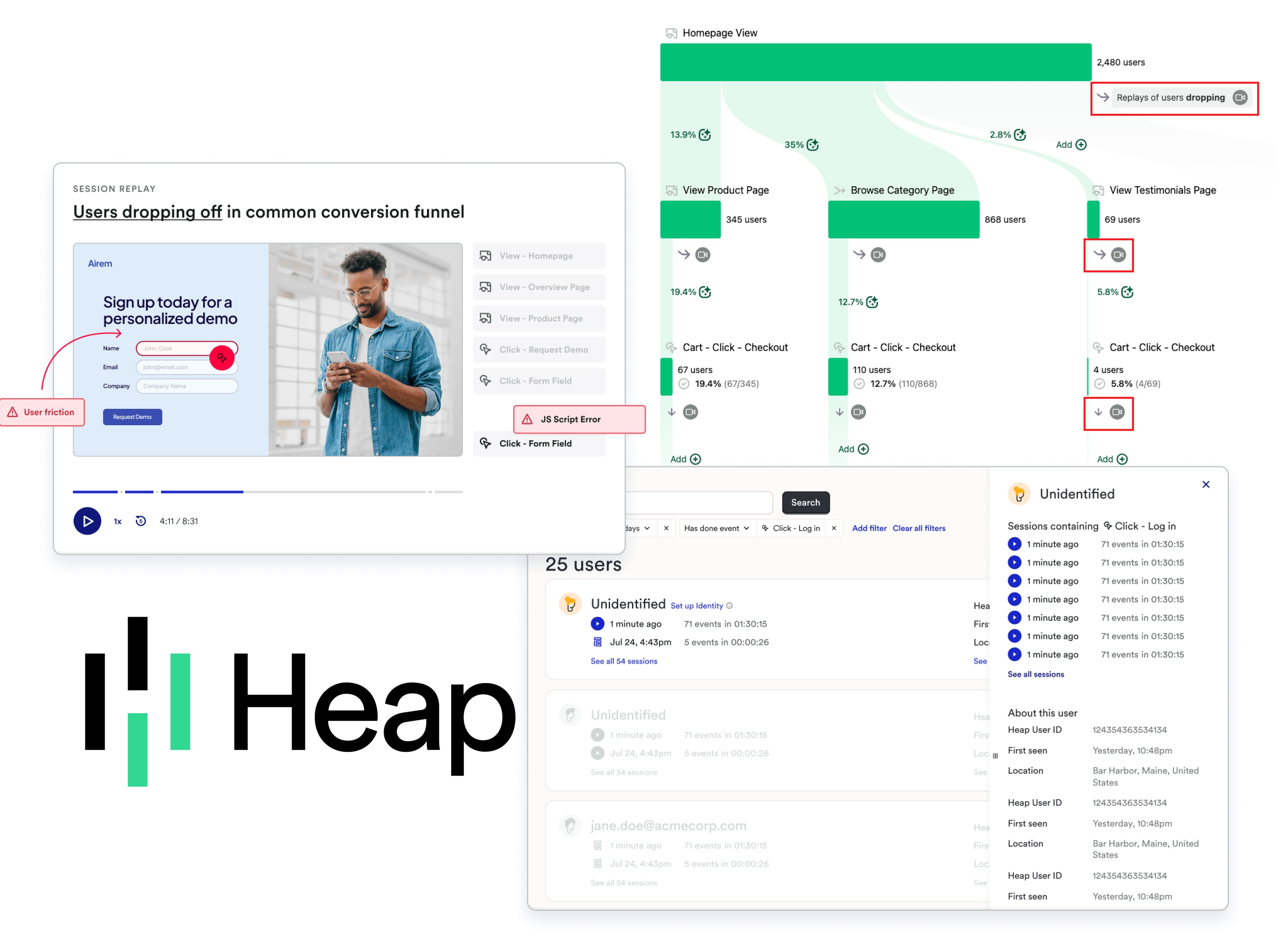
I dove deep using two research powerhouses. First, we got crafty with "dogfooding," using our own platform to gather administrator feedback. Meanwhile, Heap Analytics became our window into user behavior, revealing the raw, unfiltered truth through session replays and pathway analysis.
The multifaceted challenge we faced:
Enterprise Pain: Administrators were spending 3+ hours recreating forms instead of reusing existing ones.
User Experience Crisis: On the crowd side, thousands of users encountered walls of questions with no progress indication.
Technical Debt: The platform's strength—extreme customization—had become its weakness. Customer service was overwhelmed with personalization tickets, while the underlying data structure made it nearly impossible to extract meaningful insights for visualization.
The insight - inception :
What if accessibility requirements weren't constraints, but the key to solving our deeper UX problems?
Could universal design principles help us create better experiences for both enterprise administrators and crowd users?
Crafting Solutions for Two Worlds
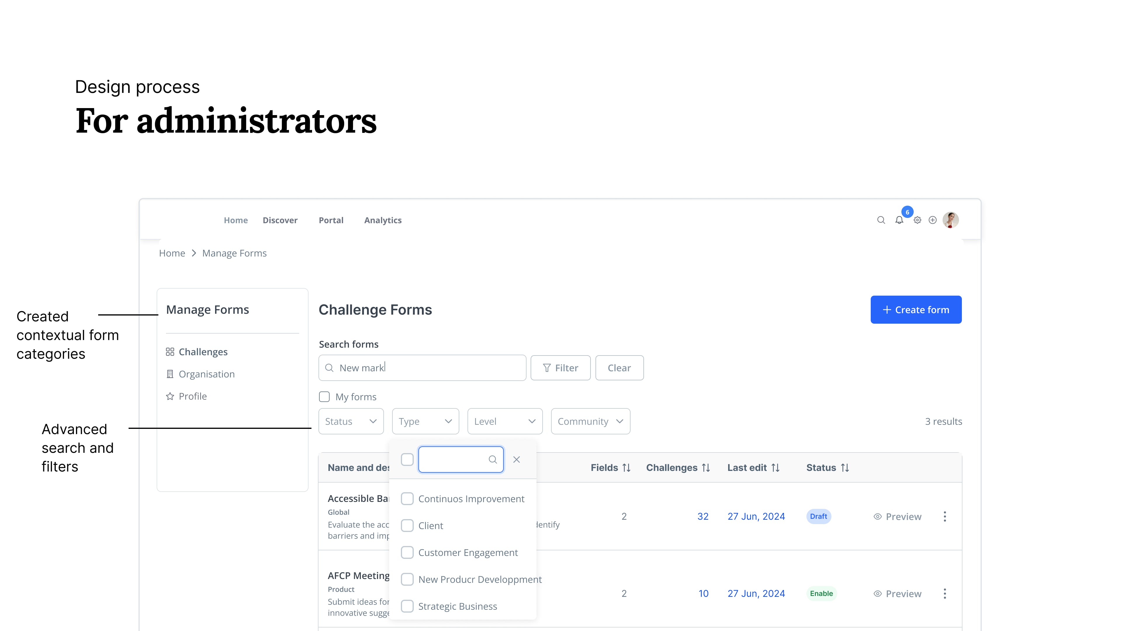
For admins:
Strategic Template Architecture. Working with our Product Manager, we restructured the entire form library. Rather than fighting customization, we embraced it strategically—separating forms by purpose (challenges, ideas, evaluations) and making templates so compelling that creating from scratch became the less attractive option.
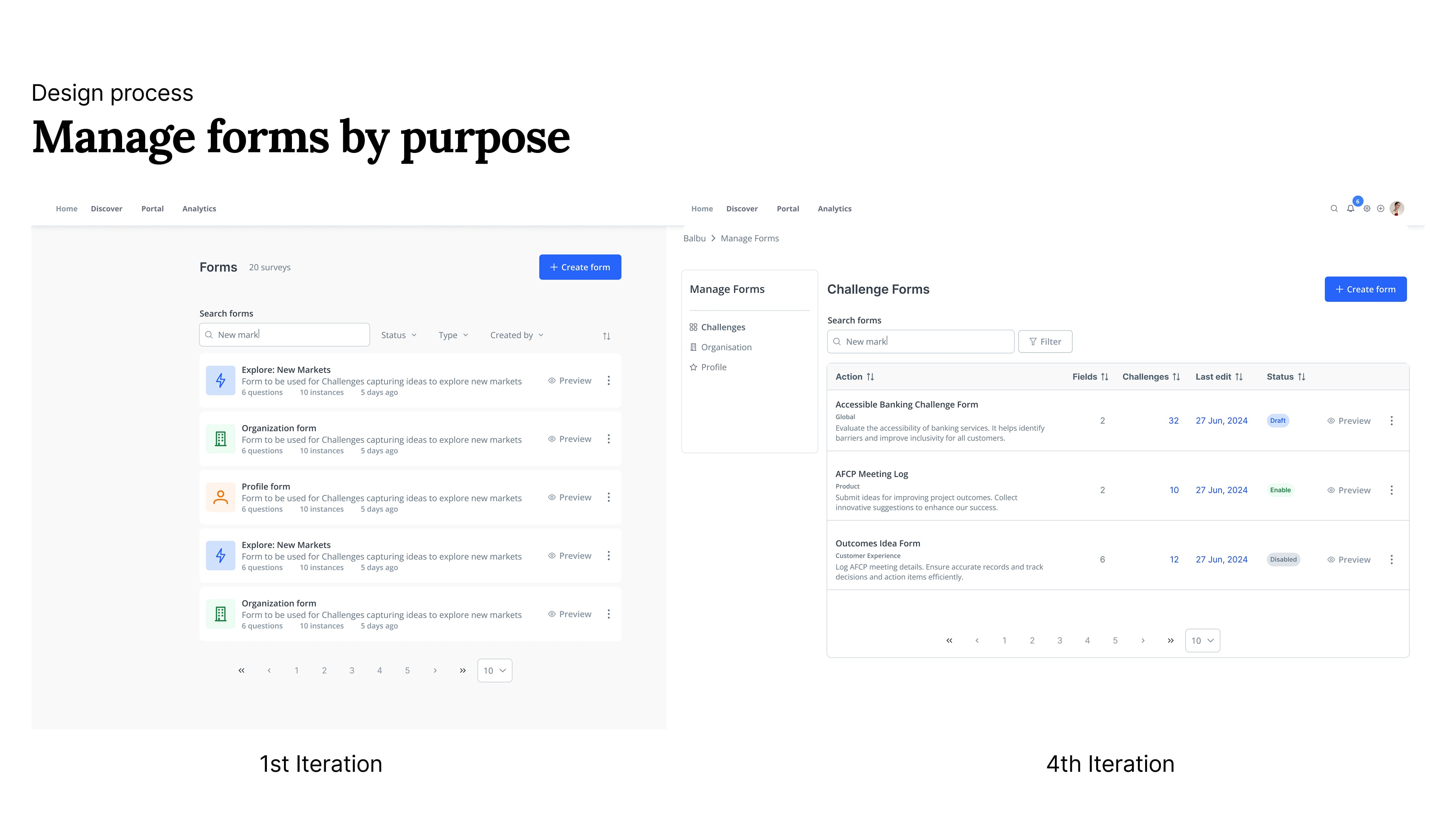
Administrative Efficiency Tools. For administrators managing hundreds of forms, I designed comprehensive filtering, sorting, and bulk action capabilities. This wasn't just about organization—it was about transforming form management from a tedious task into an efficient workflow.
For end users:
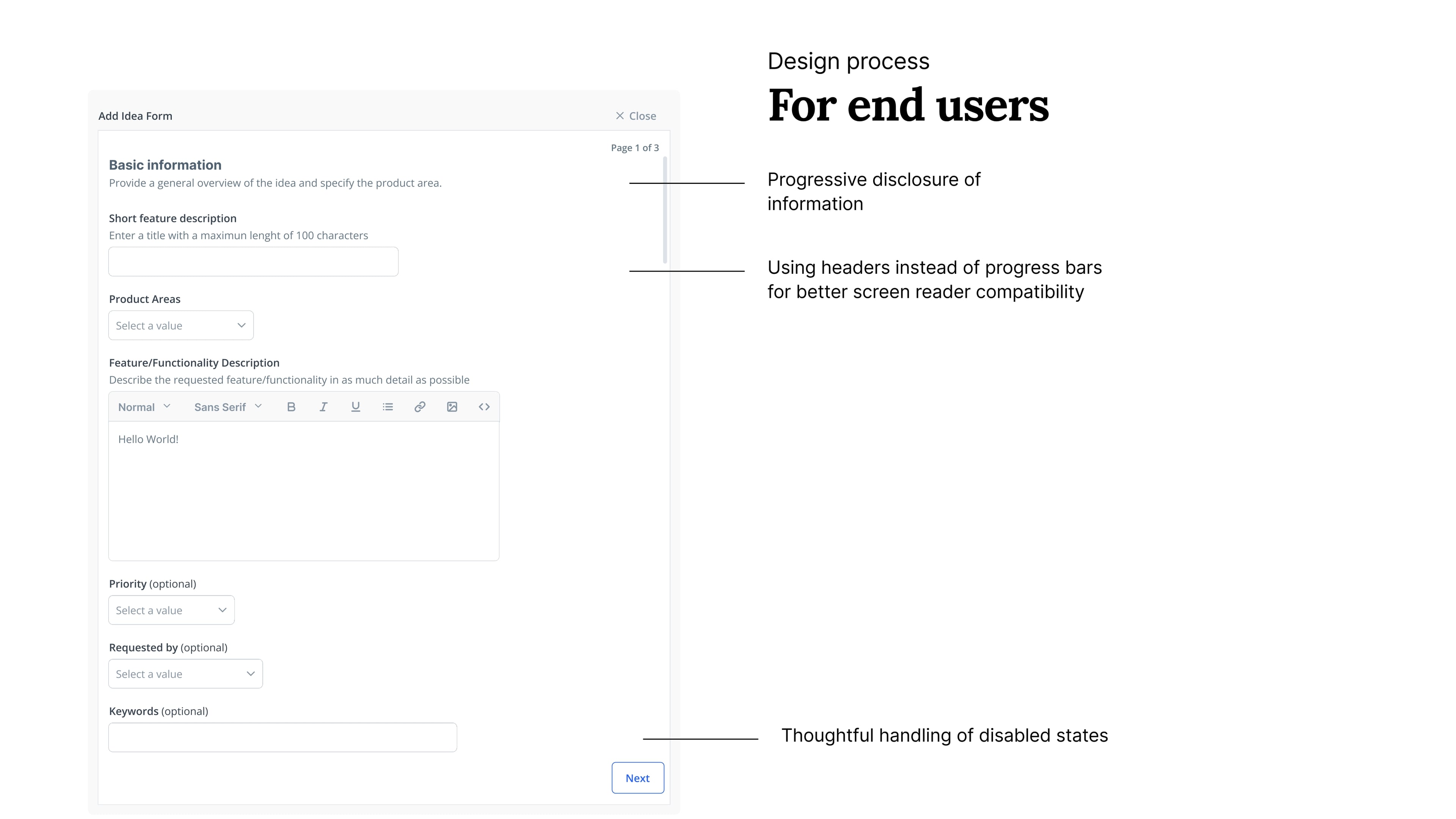
The Page-Based Revolution. Instead of sections that could pile up into overwhelming single pages, I designed a true page-based system. This served both user types: administrators could focus on one topic with a manageable set of questions, while end users experienced digestible, conversation-like flows.
The Accessibility-First Design System. Every interaction pattern was chosen through the lens of universal experience:
High contrast design that worked for everyone
ARIA labels and semantic HTML for screen readers
No disabled buttons (screen readers can't understand them)—instead, clear enabled states with contextual feedback
Optimized keyboard navigation throughout
Page numbering instead of progress bars (e.g., "Page 2 of 5")—more accessible and less anxiety-inducing than percentage-based indicators
Field widths should vary. This one was my PM suggestion, I initially resisted — we’re used to making all fields stretch to the container, but I researched and re-learned. The width of a field should be in function of the expected content.
The team dynamic
Since accessibility was legally required for our enterprise clients, everyone understood its importance. But translating compliance into better UX for everyone—that was the real conversation.
The most complex part wasn't the design—it was orchestrating the technical implementation. We had just finished adapting our design tokens using PrimeNG as a base, so the component library was solid. The challenge was helping developers combine these components into larger, more complex structures.
Key negotiation moments:
Balancing form flexibility with data consistency
Ensuring accessibility compliance without sacrificing customization
Creating reusable patterns that could scale across different use cases
Advocating for user experience when technical constraints pushed back
Strategic Foundations for Transformation
Due to project timing and my departure, I wasn't able to see these solutions fully implemented and tested with users. However, the indicators of success were clear: more reused forms, less new forms and fewer abandoned submissions.
Also, beyond the design, I provided a documentation layer to ensure design decisions were transparent, repeatable, and scalable across the platform.
What started just an UI refresh and accessibility compliance morphed into deeper- something kinder.
Accessibility isn't just about compliance—it's a design philosophy that creates better experiences for everyone.